
The rapid design and release of a new feature
About
Many schools across the nation engage in fundraising year-round. Parent Associations need flexible ways to boost funds with minimal effort beyond the school staples of Christmas and Summer Fairs.
EdTech start-up Classlist supports school parent-to-parent communities with a communication and fundraising solution with their events. Commission on ticket sales, as well as advertising at schools with high numbers of weekly active users, are key factors in its ongoing growth.
A non-digital raffle is a traditional fundraiser in the UK, but organising tickets in envelopes to send out to parents in school bags, collecting the cash, and counting it is labour-intensive. This presents an interesting, fun and creative opportunity to digitalise the process, saving Parent Associations time and helping Classlist grow.
The challenge
Design a digital raffle solution that:
A. works in harmony within the existing product and
B. can be rolled out to schools within six weeks to make the Christmas period!
This meant creating screens and flows for:
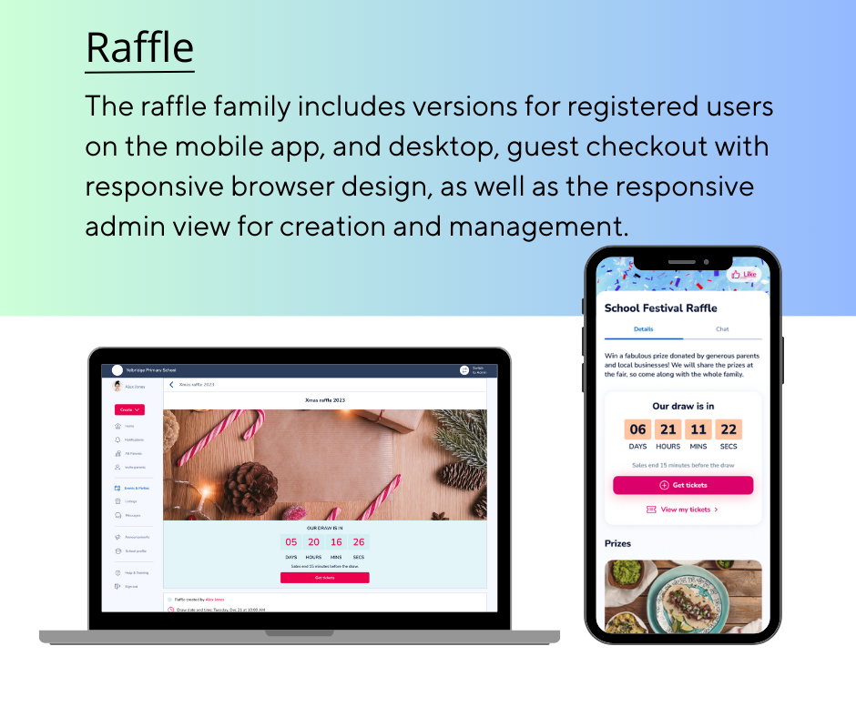
- The creation screens to work for the admin event organiser on mobile or desktop
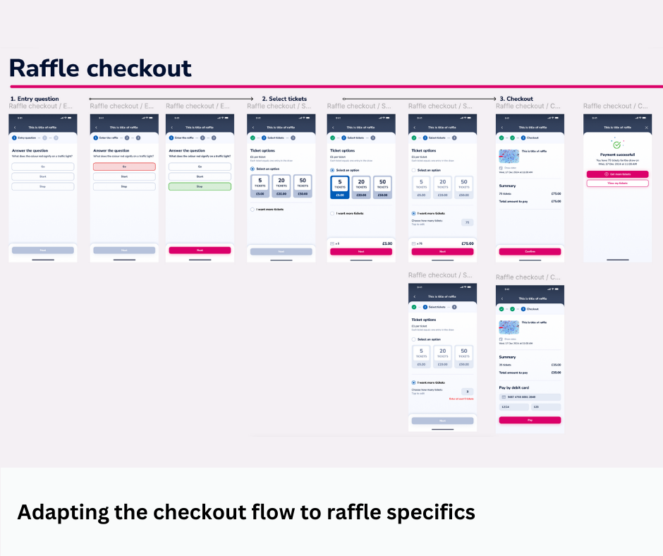
- Mobile-first checkout for the parent members
- A responsive guest checkout webpage for non-members
- An event organiser sales dashboard to manage the prizes and winners
- Email and notification definition and design where appropriate e.g. Tickets now on sale, your purchase is confirmed and, you’ve won/sorry, you’ve not won a prize.
My role
As the Product Owner of Classlist and the sole UX designer for the new raffle product, my work included: creating the flows, wireframes, user journeys, and communicating these to the engineering team.
Happily, I worked closely with a skilled visual designer who was available to style and brand the wireframes to leave everything pixel-perfect for final delivery.
Approach
My goal was to create a no-hassle raffle that allows anyone to set up a raffle and start selling tickets in less than five minutes from their phone.
The solution would be mobile-first, but also available on the desktop.
- Design: 2-week sprint with customer input
- Build: 2-week sprint
- Test and launch!
- Customer research, conducted earlier, had gathered insights around needs.
- Market research revealed many successful raffle products in this space, but none perfect for this niche.
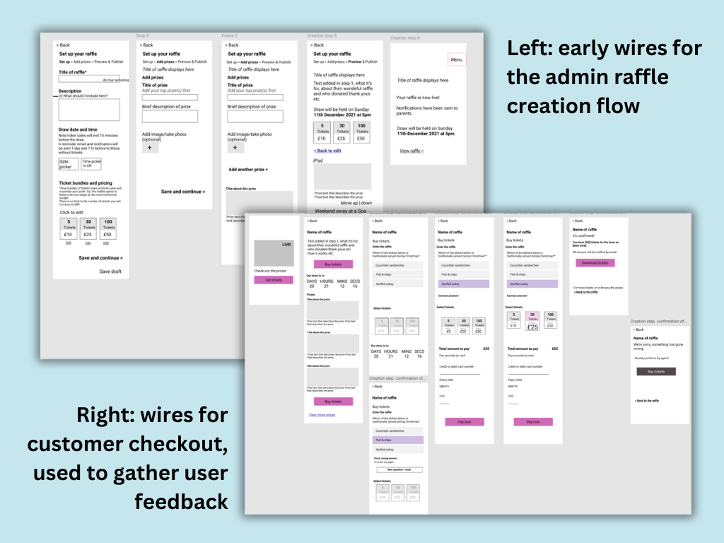
- Wireframing: As the sole UX I wireframed and used these as stimuli for user feedback. In a second round, I included the different variants for winner, unsuccessful, admin-view and guest view.
- UI design: Thankfully, our visual designer converted my wireframes into hi-fidelity, professional mockups.
- Build: Over to the engineers in close communication.
- Test: All tests ran smoothly.
- Launch! In reality, this began weeks earlier when a Wizard of Oz form to test the interest levels performed very well. During the design and build process, I reused materials for social media and for the SLT and sales teams to share with customers.


Key learnings and reflections
Important questions arose that went deeper than the product design:
- Because of gambling laws, raffles have to meet certain requirements and use specific payment options
- In a global context, raffles are not permitted in some places; thus cultural awareness and legal consideration were necessary.
- PTAs in the UK are among the most organised individuals I have ever met, and obtaining a licence or running the raffle as a competition has not been a barrier to their fundraising success.
- Where monetary transactions are involved, creators want a full checkout preview to feel secure and confident when launching a new event, even when the product is essentially WYSIWYG.
- What people understand by “random” when specifying the randomiser logic for prize draws is not universally shared.
When I embarked on this design, there were nuances of the core product that I was not familiar with. While I do not think this impeded the raffle success, hindsight has reinforced the importance of extracting and understanding a product’s underlying principles—regardless of whether they are apparent or documented—before beginning to design new features.
This approach can guide teams onboarding new members with education in respect to the product’s foundational values.
Outcome
The Classlist digital raffle MVP has been used by hundreds of people since launch, raising thousands of pounds for schools.
Many schools are repeat customers, which is a strong indicator of a sticky product that is doing its job.
Since its launch and in response to demand, the MVP has been adapted and expanded to allow additional organisers to collaborate and for customers to specify how many tickets they would like, with increased flexibility.
Conclusion
This has been a successful feature, built in record time with a small team. It has achieved revenue for the business and customers. Its usage grows year on year.
Despite there being many learning moments since its release, It is also a satisfying example of how it is possible to add a new feature to a mature product gracefully and in such a way that it complements the feature set.
A clear vision, useful prior research and having all the team behind the mission were key success factors.