
Transformative redesign and rebuild of a community engagement mobile app using Google Flutter
About
This project involved a comprehensive redesign and rebuild of a startup’s school community mobile wrapper app. The aim was to enhance user interaction by providing real-time connectivity for parents and school communities with an app built with Google Flutter. This use of modern technology would, in turn, help the business maintain a competitive edge.
The challenge
- The wrapper app was ineffective in engaging users.
- Lack of instant messaging notifications and real-time updates for parents.
- Outdated appearance with poor accessibility.
- Extremely tight timeline with no existing documentation or design library.
- Small team requiring multitasking across various roles.
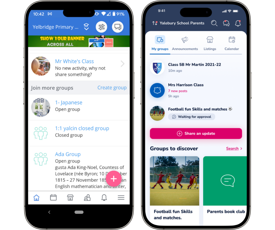
Far left: the predecessor wrapper app, to its right the resulting Google Flutter redesign.
UI/UX updates included:
- Navigation
- Content design
- Microcopy
- Colour scheme
- Interactions
My role
As Product Owner I spearheaded efforts in putting together a new version of a mature product ensuring a user-centric approach throughout the project.
I wore the hat of information architect for navigation, UX designer for copy, layout and wireframes, user researcher and UX recruitment.
This was an audacious challenge given the timeline, scale of the project and the limited resourcing.
Approach
DESIGN OPERATIONS I engaged a design agency to create a minimal style guide and layout in order to have a solid starting point and not waste time trying to address diverging styles and personal preferences. This decision proved fundamental to moving fast.
We needed a toolset for collaboration. Initially we started with Sketch, but with the arrival of an additional designer, we switched to Figma for its low learning curve and collaborative nature.
Zeplin was chosen by the engineering team for the handover.
Atlassian and Google were initially used for documentation, but were dropped for being too laborious. Essential details were documented in Jira and linked to Zeplin as the source of truth. By the end of the project there had been 2K assets exported to Zeplin!
DESIGN TEAM I successfully recruited a UX designer to collaborate on mapping across features, testing out current ones and making usable and delightful improvements while migrating the content across.
During the project, an incipient design system emerged in Figma building on the initial style guide and thanks to the designers. This was useful for faster wireframing and design. Although we got tired of some of the colours, having a limited set ensured the first version had visual consistency and coherence, creating a positive impression.
INFORMATION ARCHITECTURE I conducted card sorting to restructure the navigation, with a mobile-first approach and considering user and business needs.
I created wireframes from which the UX/UI designers worked to provide a polished, hi-fidelity UI.
COPY WRITING I developed a more friendly tone and aimed for more descriptive page titles and subtitles. I added in supportive, in-context help. This was somewhat lacking in the previous version and users had to access the helpdesk for information, which felt cumbersome.
DEV TEAM I liaised almost daily with dev and QA teams to align proposals with backend functionality and timelines.
USER RESEARCH I ran research sessions to refine ideas and mockups, as well as to understand more deeply the users, and their needs and goals.
TEST AND FIX When features started coming through, I was hands-on testing and working with the team to adjust solutions when necessary.
MARKETING I always reuse design assets for marketing and encourage designers to use realistic copy in the mock ups so we can be efficient. In this way, the basic dev delivery served for social media, banners and help desk content.

Key learnings and reflections
Understanding user expectations
There were some challenges that needed revisiting. Interestingly, these basic, everyday items often required the most iteration. For example, certain notification texts or their frequency, the aspect ratio of an image, or how links behaved have needed ongoing adjustments to make them work just right.

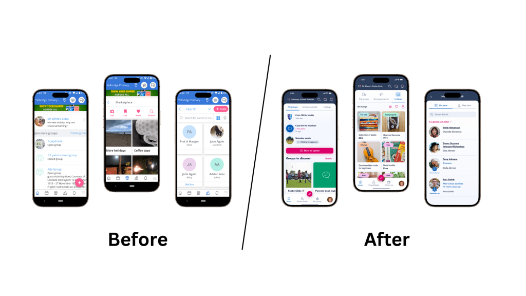
Far left Marketplace listings in the wrapper app, on the right, the latest version.
Images are fundamental to satisfying users of a B2C product. The cropper behaviour, aspect ratio and image quality was sometimes a challenge of the redesign.
I developed a deeper understanding of users’ expectations regarding visual consistency on the one hand, and flexibility in how a product is used on the other. This led me to adjust priorities to ensure user satisfaction more effectively.
Valuing user contact
I felt privileged and energised by actively listening to users throughout the process. Although there was a temptation to get lost in the details and keep my head down, this focus kept my perspective broad, allowing me to keep my eye on the horizon despite the thousands of details I was designing and reviewing each day.
Balancing standards and adaptations
I recognised the importance of finding a balance between adhering to current design standards and making bespoke adaptations that catered specifically to this product, our business, and our users.
The investment in designers and the simultaneous creation of a design library and toolset also facilitated later ideation, resulting in faster, more efficient new development.
Understanding the technology
Link handling, image quality and copy-pasting were aspects that needed unexpected levels of attention. These essentials truly are the foundation for a good experience. User expectations and familiarity with how HTML behaves caused some friction with expectations with early releases of the Flutter app.
Shifting mindset
My mindset evolved; I became more flexible in terms of which features I considered essential. I accepted the complexities of the project and acknowledged that there would be both good days and challenging ones.
I also see how a project is never really finished, this is just one evolution.
Navigating project dynamics
I became adept at zooming in and out at different detail levels, learning when something was “done” rather than “perfect,” while also discerning when something wasn’t good enough to pass on to engineering.
Overall, this project not only advanced my skills and understanding of product management but also deepened my commitment to creating user-centric solutions that genuinely resonate with the community. This can mean adaptation as user groups change, and rapid course corrections when needed.
Outcome
The Classlist Flutter mobile app has led to increased global sales and created a huge competitive advantage by being a truly modern experience in the EdTech space, often surpassing expectations. It has been described as a ‘slick and easy-to-use’ solution for school communities.
The core project took approximately 12 months; a fantastic result for the team and the business.